17 Aug 2012

i am summertime.


I can't help but feel good while peeking at the sun coloring the brick wall of the building opposite the work office in Soho, Steve Harrington's bright and geometric pattern's mesmerizing me and Janis Joplin's voice saying everything I want to say.

Summer time,time, child, the living is totally frickin' sweet.


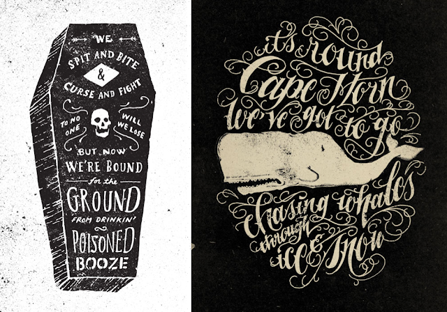
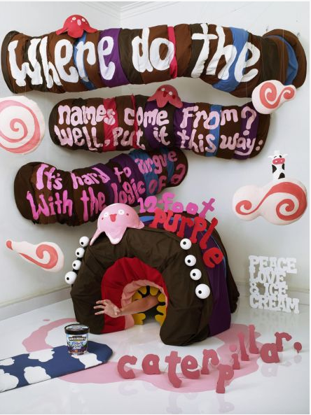
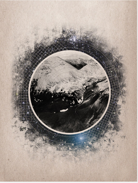
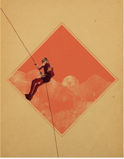
Steve Harrington's combination of flat colors, gritted texture and organic and geometric shapes and sneaky lil' characters creates playful, intriguing posters that remind me a bit of psychedelic posters. Could be Janis's subliminal messages??

13 Aug 2012

i am old Brooklyn.


These photo's capture old BK beautifully, the culture and rawness that made Brooklyn, Brooklyn.


10 Aug 2012

i am very impressed.

Jon Contino, you da man.

This Brooklyn based illustrator and typographer's work has such an exceptional standard and a special creative process, it really makes you appreciate the effort and time he takes to hand render every single letter. 

Make sure to check out his videos, which are are in them selves with shallow depth of field and muted color tones, it shows Jon in his natural environment and meticulously creating his art.

"My work speaks for itself"


8 Aug 2012

i am James Victore.


I have mentioned James Victore in a previous blog, but shit.
He's inspiring. 
Watch his videos for a fresh insight to overcome difficulties designers, or anyone, faces. 

When I grow up, I want to be a designer with a soul, jus' like you JV.


7 Aug 2012

i am impressed.


There's some seeeerious issues going on with our over-worked planet, there's no denying it.


It's really encouraging seeing some strong advertising campaigns that make you really want to root for the good guys.


I'm stoked to see some really strong messages on a handful of advertising campaigns Greenpeace have created. The variation in style and target audience is impressive. 


It's encouraging to see some beautifully designed work showcased on Behance aswell by a couple of talented buttons.


6 Aug 2012

i am super happy.


Oh how I love laughing while working at the array of twisted intelligent comedians that fill the web with their witty jokes. 
I leave work snickering at the crass jokes I listened to, and try hard to remember exactly how they went, so you can pass it on to someone else. But you always forget the main part of the joke, and end up creating a major anti-climax and look like a muppet.

It makes me pretty happy looking back through your bookmarks bar and re-discovering the beautiful design you hurriedly apple D's back in the dizzay.

Love this collection of typographical advertising, found on Curiocity.


31 Jul 2012

i am confused.

My mood changed rapidly on my way to work this fine/shweaty morning.
 1. I was intrigued by all the protester's kipping in the sun at Union Square
8. I was disgusted by the petition being signed to sue the dump truck company, who's driver hit and killed a lady, and fled the scene. 

24. I was saddened by the homeless man picking the dirt off his bare rugged feet.
103. I was warmed by the other homeless man who was bending over and smelling and inspecting a little pink flower. I don't care if it was because he was cracked out of his mind, I think we all need to learn to stop and smell the roses every once and a while.


It's so easy to spend a whole hour or so flicking through forgotten-hopes beautiful array of designers and illustrators. I love that the focus is on collage based design, I wish I had some scissors and old vintage books in front of me, hack.


 Brent Hildy has a way of laying out his finds to create symmetry and white space. Love the color palette he uses too.